This post is sponsored by Lowe’s.
Did you hear? The DIY Dream Team is heading to Atlanta to do a complete bedroom makeover for one lucky homeowner? That’s right, Angela (@angelarosehome), Jennifer (@makingprettyspaces) and myself along with Lowe’s Home Improvement selected a winner after holding a room makeover giveaway contest on instagram!

The three of us have been feverishly designing and planning a room makeover that will take place over the course of only 2.5 days. And planning said makeover in another part of the country isn’t an easy task, let me tell ya! Here is the room we are giving a fabulous makeover and how it currently looks:

It’s a blank canvas for the DIY Dream Team to work some awesome magic on! We are going to make a significant impact on this space in a short amount of time I can assure you of that! We are going for a bold, simplistic, modern style kind of like Angela’s bedroom seen here:
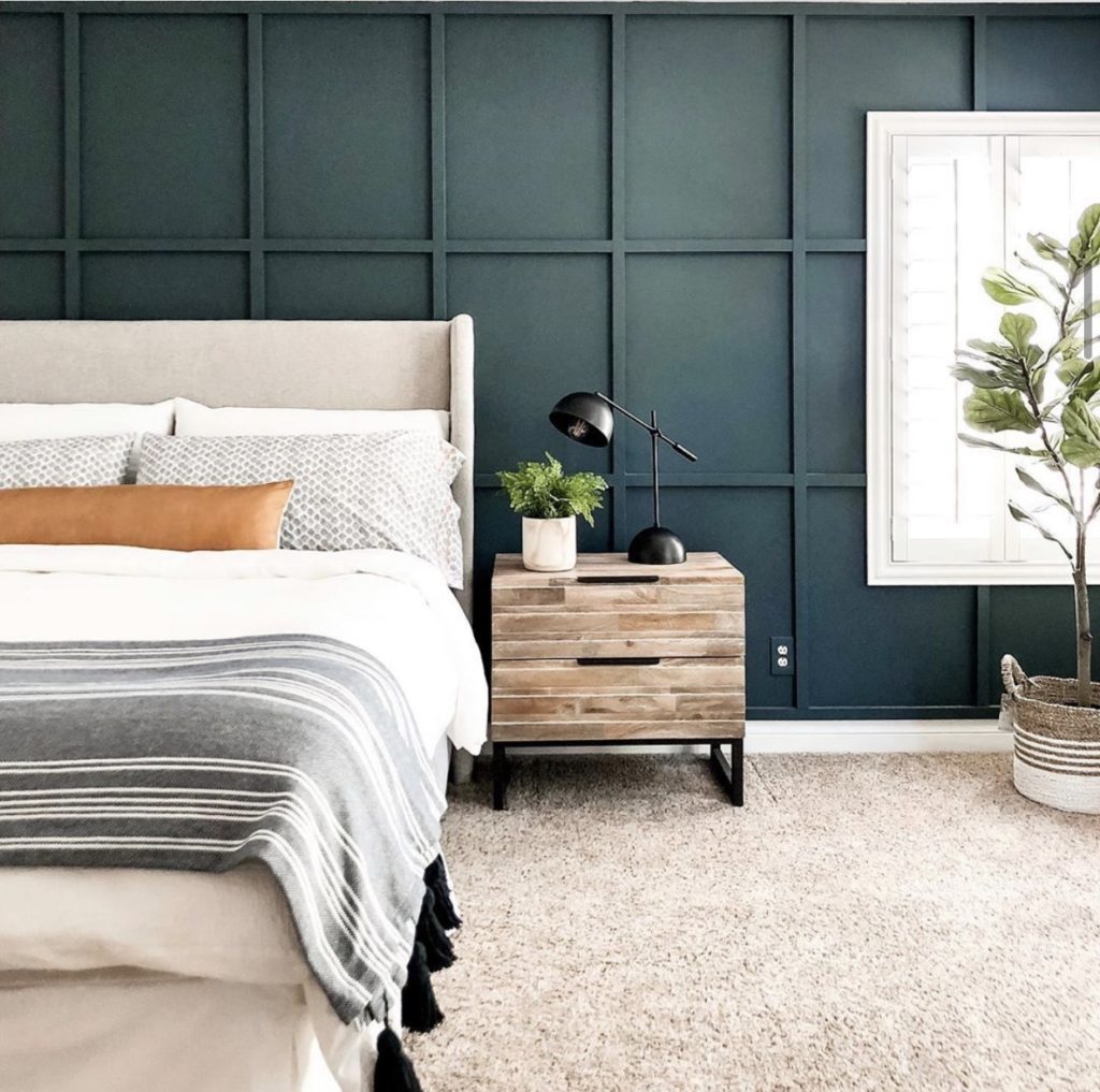
However, there are some problems in the space that we inevitably have to work around. Let me show you what they are and how we plan to address them.
The Tray Ceiling
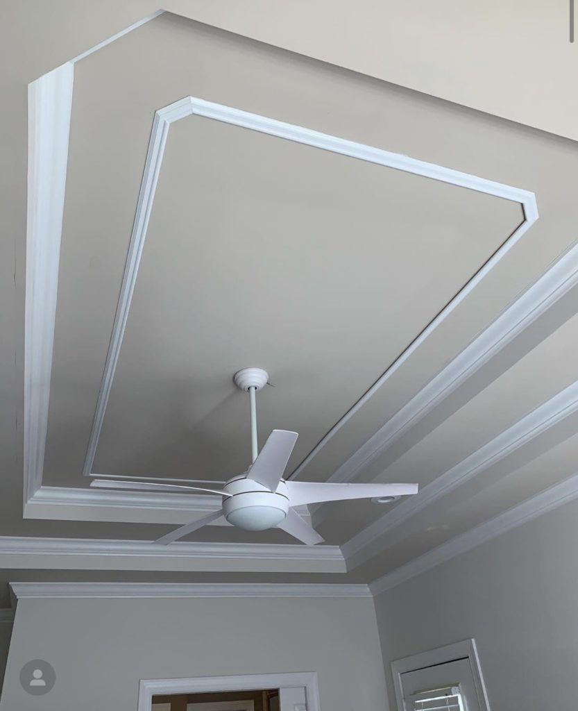
This isn’t just any ol’ tray ceiling, we’ve got a triple layer tray ceiling! This was an architectural design trend many years ago, but isn’t viewed as the most popular thing nowadays. We plan to solve this multidimensional look by painting it all one solid color. It will visually blend it all together and not draw the eye to all the layers. We’ll be using this HGTV Home by Sherwin Williams paint, our favorite angle brush for all the trim work, and of course a good extension roller.
I actually have a single tray ceiling in my dining room, and the way I addressed it was with some faux beams I made. Another good option when faced with a difficult tray ceiling!
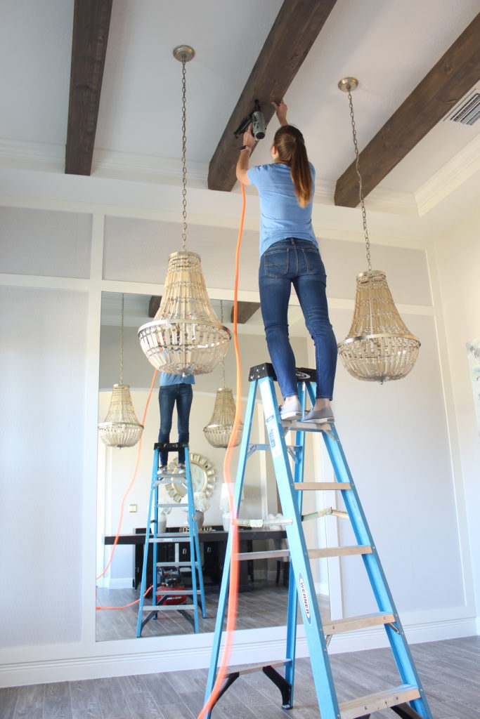
To make each faux beam, I simply used four 1x6x8 common boards. I screwed one board flush to the ceiling and nailed the other 3 around it in a box formation using my nail gun and compressor. You can see the full post and tutorial here.
The Exterior Door
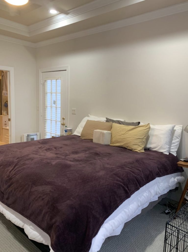
As you can see from above, there’s an exterior door in Nicole’s bedroom that is on the same wall that her bed sits. This leaves little to no space for adequately sized nightstands flanking her bed. Overall, it just really minimizes the space on that wall. Our solution? We are going to flip the bed to the opposite wall! That will give us plenty of room for a king size bed, and two 24″ wide nightstands that she wouldn’t be able to have given her current layout.
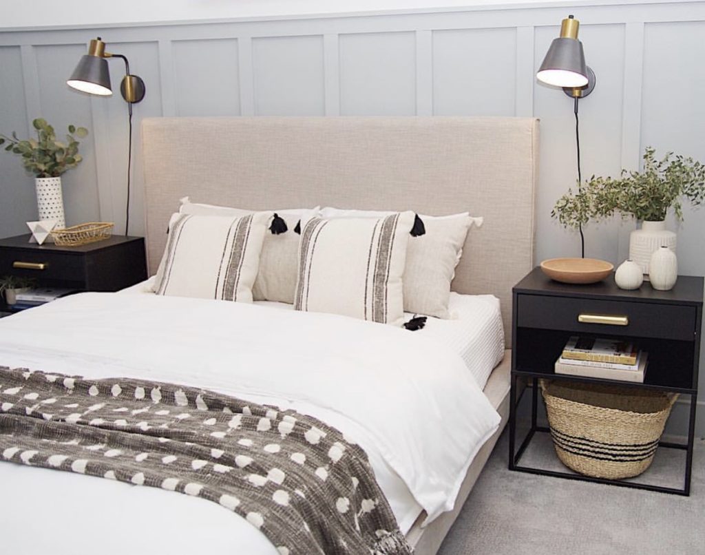
This is Jennifer’s (@makingprettyspaces) guest room that shows a great example of what we are trying to achieve by flipping Nicole’s bed to the opposite wall. Great use of symmetry and the proper amount of space for the furnishings.
Wall to Wall Carpet
Carpet versus hard surface in a bedroom is a personal preference. While I completely understand the practicality of having carpet in a bedroom (hello warmth and softness under your feet), it doesn’t always look appealing from a design perspective. In Nicole’s situation, the carpet is actually fairly new and she and her husband would like to keep it. Our design solution? A beautiful new area RUG that will sit under the bed and cover a large portion of the carpet.
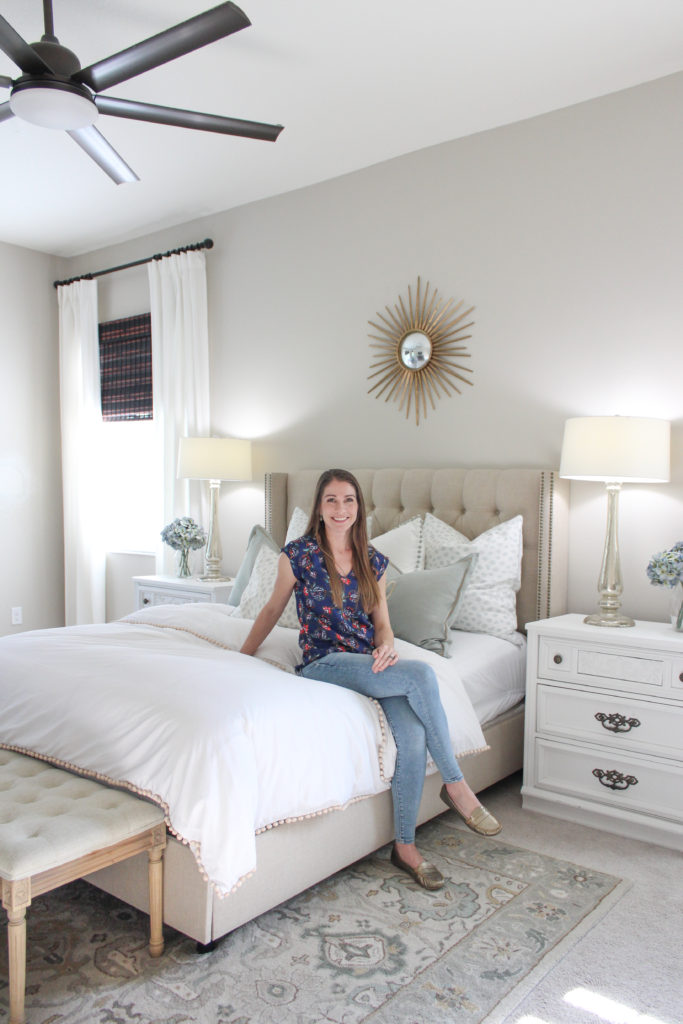
Here’s my bedroom where I have done the same exact thing! I used an 8×10 area rug to cover a lot of the carpet, and pull together all the colors in the space. Some other awesome rugs I love are this one and this ever popular one.
The Blinds
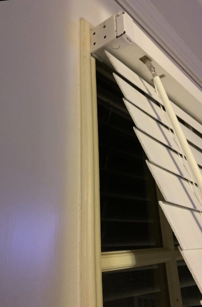
Like a lot of homes, Nicole’s bedroom has these outdated blinds that we plan to replace with something more up to date. We also want to make sure what we replace them with is black out and gives her plenty of privacy and darkness for sleep. There are so many shade options, but after shopping around we really fell in love with these cordless solar shades. They are trim and go which means you buy them in store and have them cut on the spot to fit the custom dimensions of your window – so convenient! And the quality is awesome. In addition to the roller shades, we are going to add these neutral colored curtain panels to each window as a decorative touch.

Here is another visual of the design we hope to achieve for this makeover. Just like any space, there are plenty of problems we have to work around, but I have no doubt we can turn this into a beautiful and comfortable space for Nicole and her husband. Make sure to check out Jennifer’s blog with more details about the design, and Angela’s for all of the projects we plan to tackle in the space.
Mood Board Sources:
Dresser
Chair
Side table
Floor Lamp
Tree
Rug
Curtains
Bed
Night stand
Sconce
Mirror
Basket